
A QA audit is only as valuable as what happens after it.
Most consultants deliver a document — usually a wall of text, sometimes with a spreadsheet attached — and disappear. Your team reads it once. The issues get triaged in a Jira backlog. Six weeks later, nothing has changed and everyone has moved on.
The reason this happens isn’t that teams don’t care. It’s that a static document is the wrong tool for driving remediation. It’s built for the person who wrote it, not for the people who need to act on it.
Here’s how MiQA structures every QA audit — and exactly what you receive when we’re done.
Two Deliverables, Two Audiences
Every engagement produces two artifacts designed for different jobs:
- An executive report — a presentation-ready PDF your leadership team can review in one sitting
- An interactive dashboard — a live, trackable tool your engineering team works through until every finding is resolved
Neither one replaces the other. The report answers what is our QA situation and why does it matter. The dashboard answers what do we fix next, and how do we know when we’re done.
The Executive Report: A Walkthrough
The report is structured as a presentation — not a document. It’s designed to be opened in a meeting, not emailed as an attachment. Here’s what it covers.
Slide 1: Cover & Audit Identity
The report opens with the engagement scope: the company name, audit date, and the auditing team. Each report is specific to a single engagement — not a generic template.
Slide 2: Executive Summary
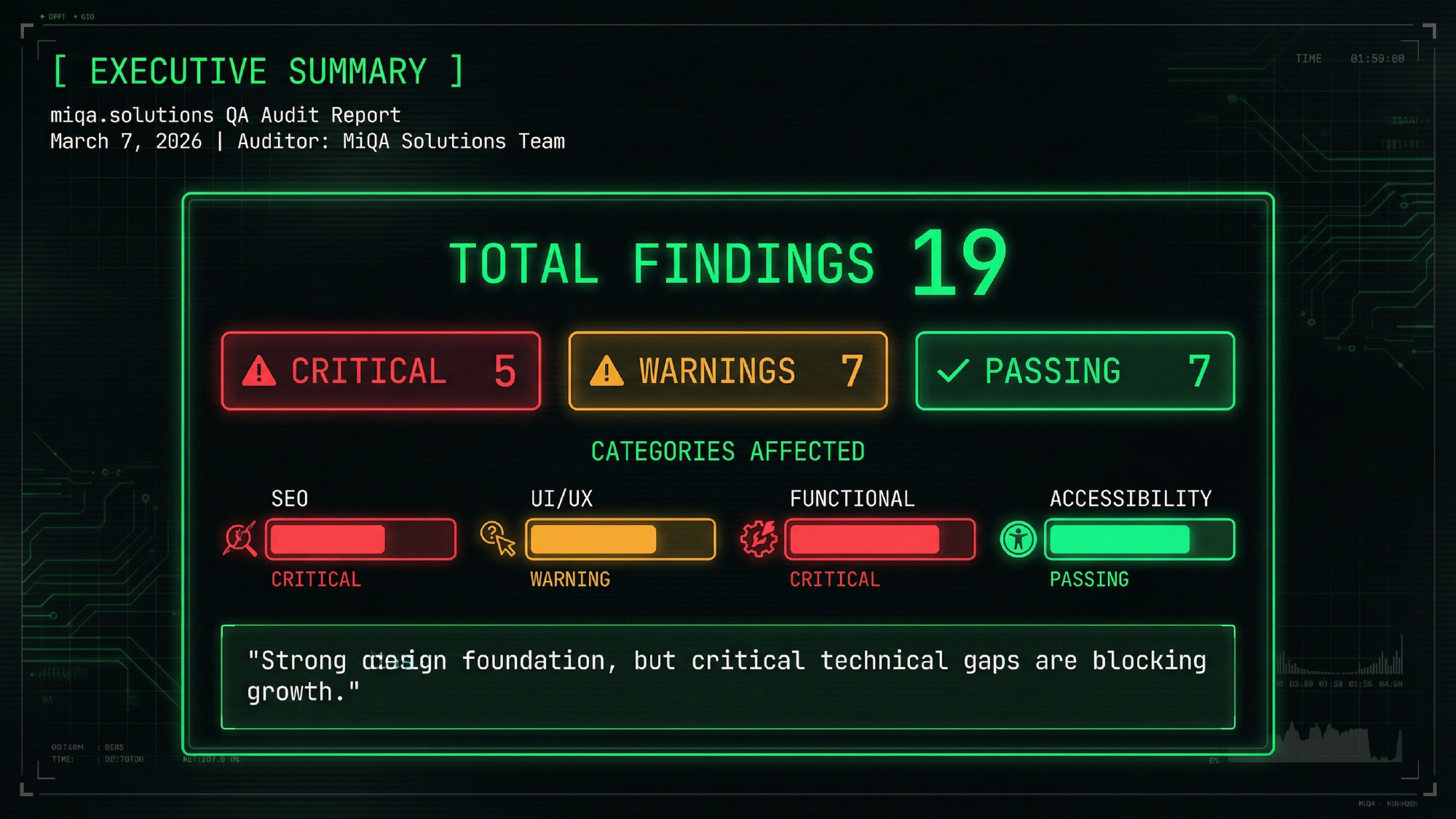
This is the slide leadership spends the most time on. It surfaces the headline numbers immediately:
- Total findings — in a recent example engagement, 19 issues across four categories
- Severity breakdown — 5 Critical, 7 Warnings, 7 Passing
- Categories affected — SEO, UI/UX, Functional, Accessibility
- One-line diagnosis — a plain-language summary of the overall situation (e.g., “Strong design foundation, but critical technical gaps are blocking growth”)
No jargon. No preamble. The CTO or founder reading this knows within 30 seconds whether they have a serious problem.
Slide 3: Scope & Methodology
A brief, transparent breakdown of what was examined and how. For a typical SaaS product audit this includes:
- Target assets (specific URLs or product surfaces audited)
- Methods used: manual UX/UI review, technical SEO analysis, accessibility audit (WCAG 2.1), performance profiling
- Tools deployed: Lighthouse, Chrome DevTools, Axe-core, Schema Validator, and others depending on the stack
This slide exists because findings only mean something if you trust the method that produced them.
Slide 4: Severity Breakdown
A visual breakdown of the 19 findings — showing the proportion of Critical, Warning, and Passing items at a glance. In the example engagement:
- 26.3% Critical — issues requiring immediate action to prevent functional or reputational damage
- 36.8% Warnings — issues that degrade performance or user experience within the next development cycle
- 36.8% Passing — areas already well-implemented that should continue to be monitored
The point of this slide isn’t to alarm. It’s to give engineering leadership a defensible prioritization framework — one they can use when pushing back on “fix everything now.”
Slides 5–6: Critical Findings (Detailed)
Each critical issue gets its own breakdown. In the example engagement, two slides covered five critical issues:
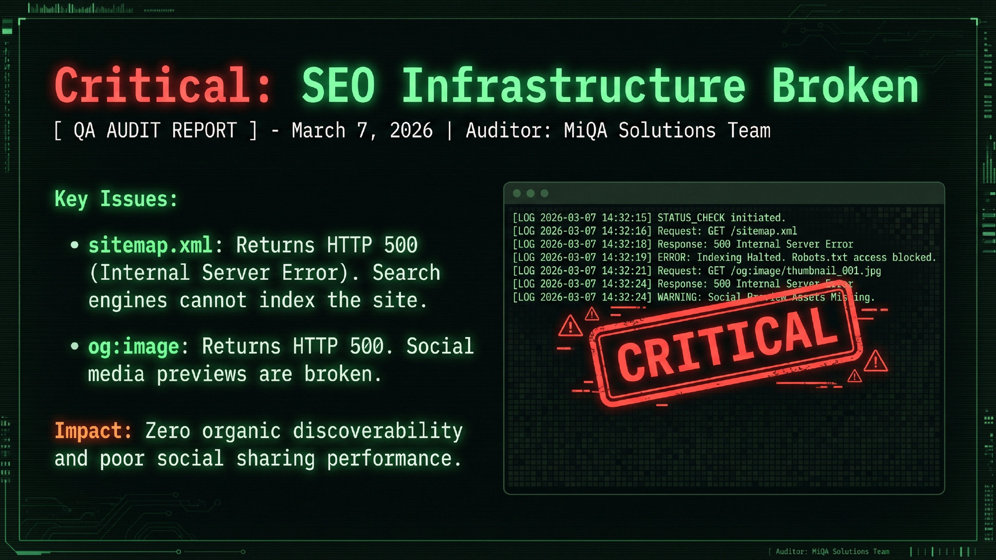
Critical: SEO Infrastructure Broken
sitemap.xmlreturning HTTP 500 — search engines cannot index the siteog:imagereturning HTTP 500 — social media previews broken across all platforms- Business impact: zero organic discoverability, broken social sharing
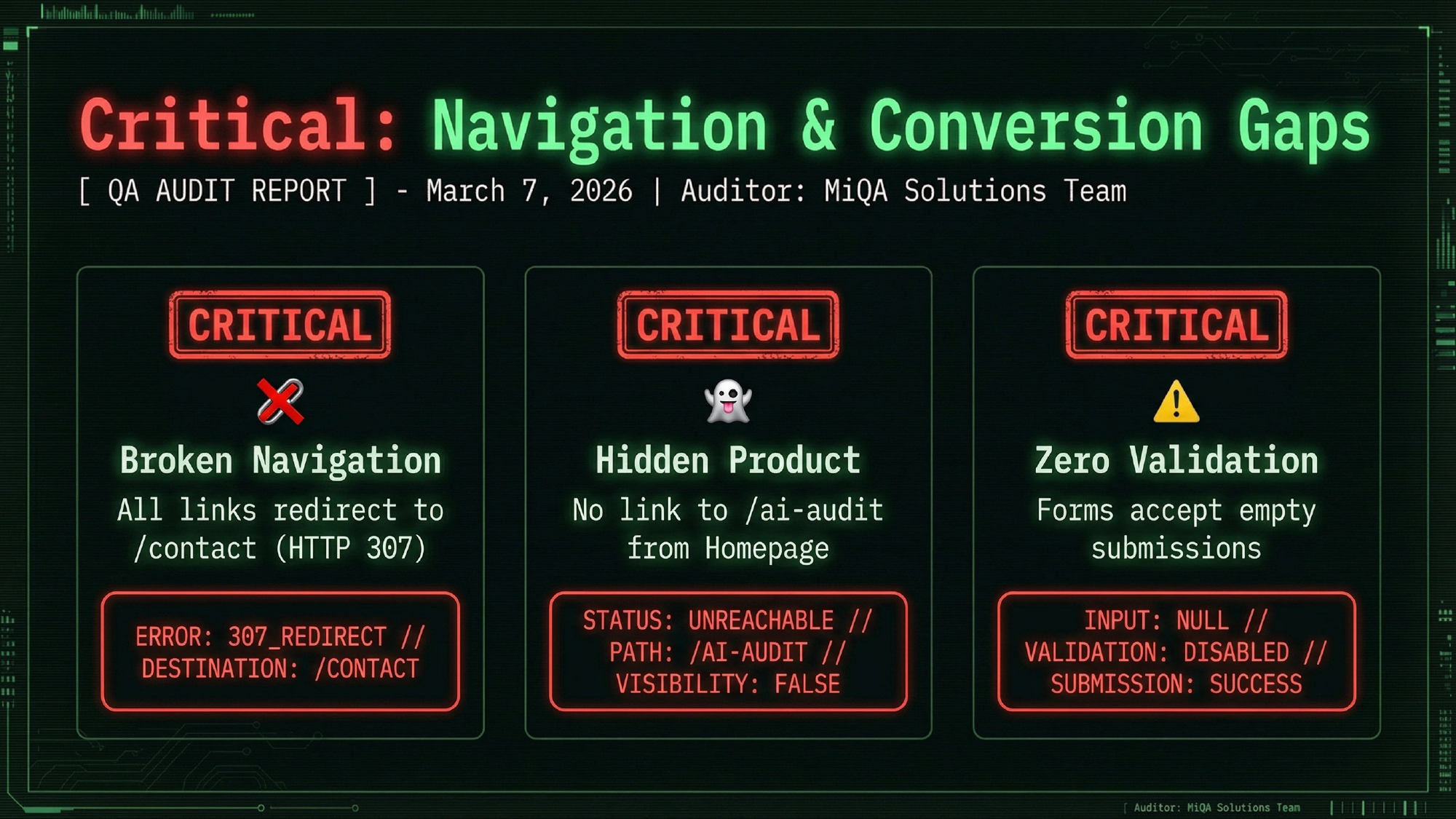
Critical: Navigation & Conversion Gaps
- All navigation links redirecting to
/contact(HTTP 307 redirect loop) - Core product page not linked from the homepage — effectively invisible
- Contact form accepting empty submissions — zero input validation
Each finding includes the error evidence (server logs, status codes, behavior description) alongside the business impact. This format is specifically designed so an engineering lead and a non-technical founder can read the same slide and both understand why it matters.
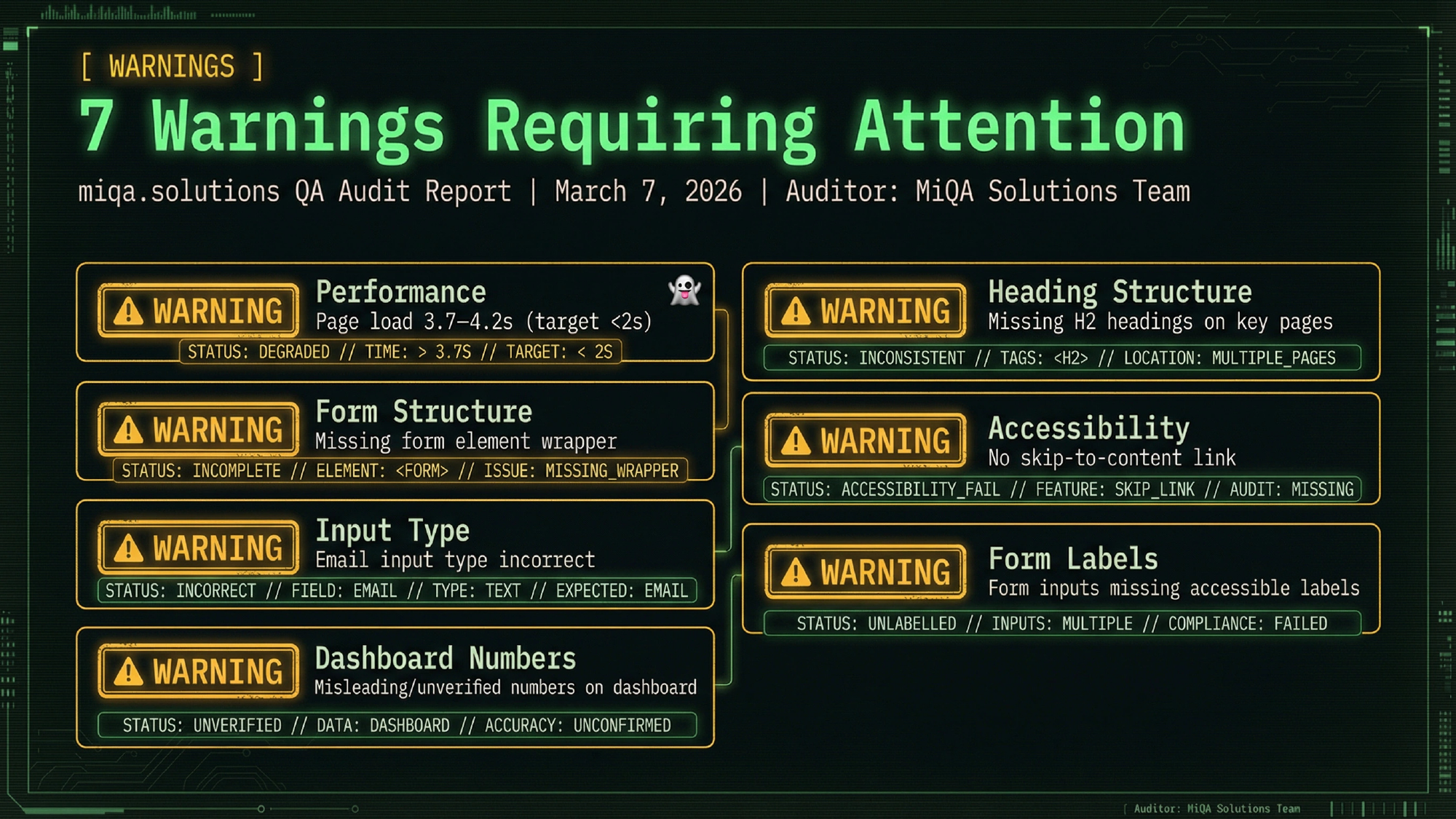
Slide 7: Warnings
Seven medium-priority items in the example engagement, presented as a grid with severity badge, category, and a one-line description:
- Performance — page load 3.7–4.2s (target: under 2s)
- Semantics — missing
<form>wrapper element - Input Type — email field using
type="text"instead oftype="email" - UX — metric counters using static animation, appearing misleading to users
- SEO — missing H2 headings on product page
- A11Y — no skip-to-content link
- A11Y — missing explicit form labels
Warnings don’t require emergency remediation, but they accumulate. Left unaddressed, they’re the issues that erode user trust and hurt conversion rates over months.
Slide 8: What’s Working Well
This slide matters. Every audit surfaces what’s already solid — because good practices should be protected, not accidentally broken during remediation.
In the example engagement, three areas were fully passing:
- SEO Foundation — meta titles, descriptions, canonical URLs, structured data, sitemap and robots.txt all correctly implemented
- UI/UX — responsive design, mobile-ready, strong call-to-action placement
- Accessibility — alt attributes on images, color contrast ratios passing WCAG, HTML lang attribute correctly set
This section also serves a practical purpose: it tells the team which parts of the codebase to treat as reference implementations when fixing the things that aren’t working.
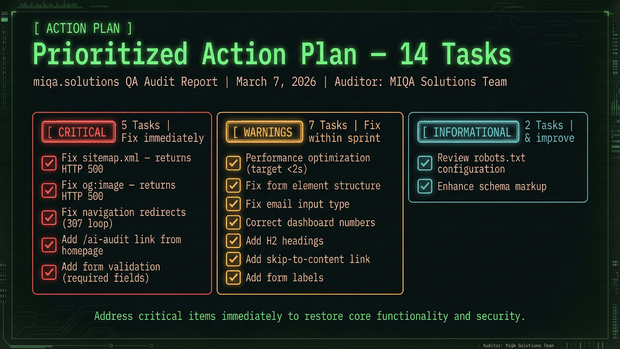
Slide 9: Prioritized Action Plan
The action plan is the bridge between findings and execution. It takes all 14 tasks and organizes them into three tiers:
Tier 1 — Critical (5 tasks, fix immediately):
- Fix sitemap.xml and og:image (HTTP 500 errors)
- Fix navigation redirect loop
- Add missing product page link to homepage
- Add form input validation
Tier 2 — Warning (7 tasks, address in next sprint):
- Improve page load speed to under 2s
- Fix form semantics and input type errors
- Add accessibility labels and skip-to-content link
Tier 3 — Info (2 tasks, review and confirm):
- Review robots.txt configuration
- Confirm structured data schema completeness
Three tiers means the engineering team has a clear answer to “what do we work on first?” — without needing to schedule a separate prioritization meeting.
Slides 10–11: Interactive Deliverable & Next Steps
The final slides introduce the second deliverable (the interactive dashboard, covered below) and outline the recommended three-phase execution plan:
- Remediation Sprint — fix the five critical blockers immediately
- Verification Audit — re-scan to confirm clean resolution with no regressions
- Continuous Monitoring — implement automated regression checks to catch future drift early
The Interactive Dashboard: Beyond the PDF
The PDF is for understanding. The dashboard is for doing.
Once the executive report is reviewed, your engineering team gets access to the interactive dashboard — a live tool built specifically for the remediation phase.
What It Contains
Every finding from the report appears as an interactive card with:
- Severity badge (Critical / Warning / Passing)
- Full description of the issue
- Specific fix recommendation — not “improve performance,” but exactly what to change and how
- Tools or approaches to use for remediation
How Teams Use It
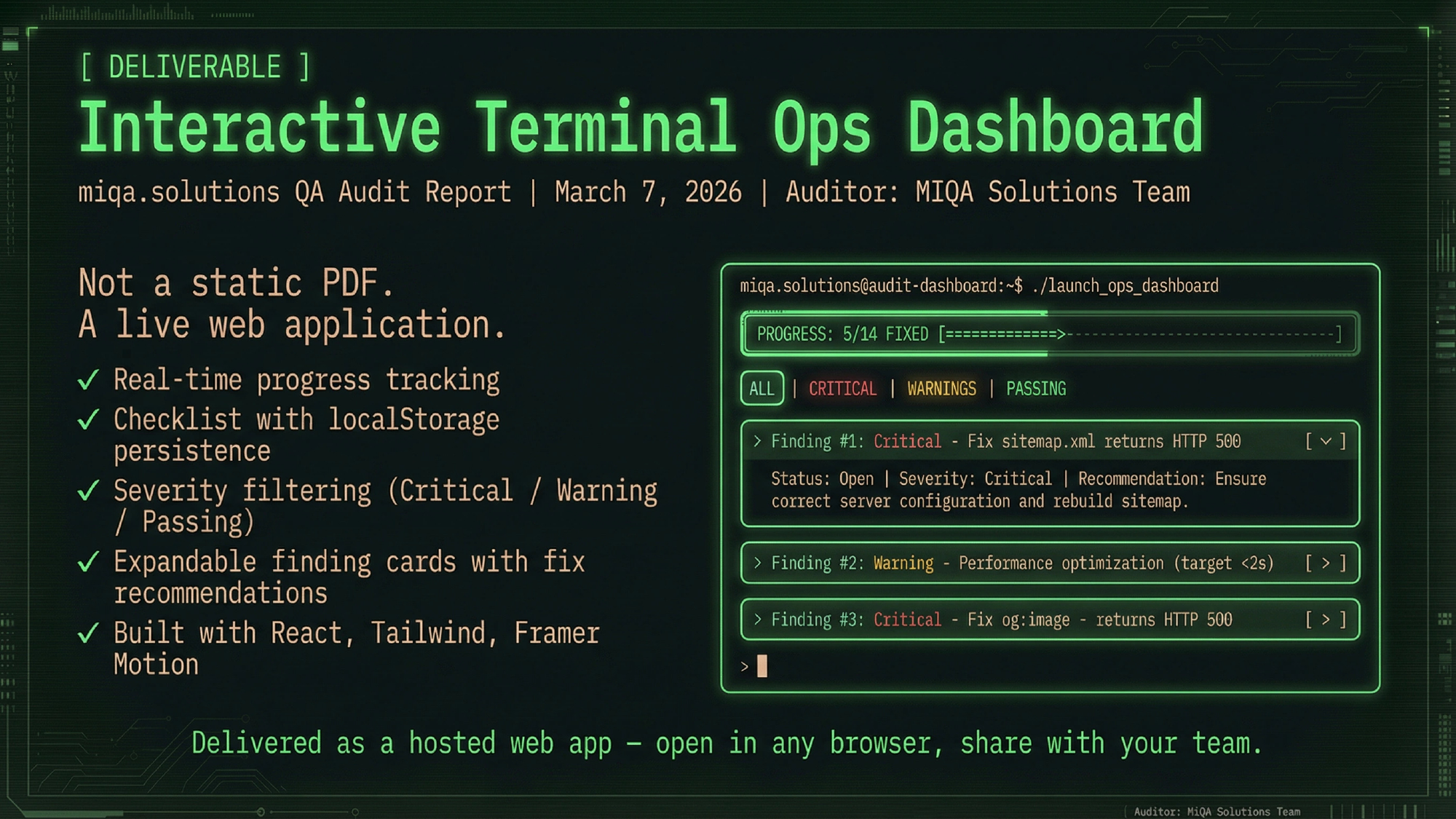
The dashboard includes a Fix Checklist — a trackable list of every action item. Engineers check off fixes as they complete them. Progress is saved in the browser so the whole team sees what’s been resolved and what’s still open.
A score ring updates in real-time as items are resolved. In one recent engagement, the team started at 62% and hit 92% within three weeks — a number they started tracking in sprint reviews.
The dashboard is organized by section (SEO, UI/UX, Functional, Accessibility for a website audit; or Release Process, Test Coverage, Automation, Observability for a product engineering audit), so teams can assign sections to specific owners and work in parallel.
Why This Combination Works in Practice
The pattern that consistently emerges when both deliverables are in play:
- Day 1: CTO and engineering lead review the executive report together — 30-minute meeting, clear alignment on priorities
- Day 2: Engineering lead opens the dashboard, assigns Tier 1 findings to two developers
- Week 1: First three criticals resolved and checked off; score ring visible in team standup
- Week 3: All critical and warning items resolved; dashboard at 90%+
- Week 4: Verification scan confirms clean state; monitoring set up
Compare that to the traditional single-PDF delivery: it gets reviewed once, lands in a Google Drive folder, and generates exactly zero committed follow-through.
What the Audit Covers
The exact scope depends on whether you’re auditing a website/product surface or a software engineering QA process.
For website and product audits, the five areas are SEO, UI/UX, Functional behavior, Accessibility, and Performance.
For engineering QA process audits, the five areas are Release Process, Test Coverage, Automation Infrastructure, Observability, and (for AI products) AI/LLM Quality.
The format — executive PDF plus interactive dashboard — is the same for both.
Who This Is For
A QA audit is the right starting point if:
- You’re a CTO or engineering lead who knows releases feel risky but can’t point to the specific reason
- You’ve had a production incident and want to prevent the next one
- You’re scaling from 15 to 50+ engineers and your informal QA practices aren’t keeping up
- You’re preparing to hire a QA lead and want to define what to build first
It’s not the right fit for teams that haven’t shipped to real users yet, or for large organizations with a mature internal QA function.
Want to see what an audit would surface in your product? Book a free 30-minute strategy call — no pitch, just a direct look at where your QA process stands and what the first move should be.